


[display-name-category]
[post_author]
Google Analytics presents an amazing list of reports that include all of the information that is useful to analyze your data and reach your marketing goals. However, not everyone is interested in gathering the same information.
The solution for this is using Shortcuts. Shortcuts provide fast access to your most commonly viewed reports. You can save your report as a shortcut, and all of the report configurations will be stored as well. To begin using shortcuts, click the “Shortcut” button on the toolbar of the report you wish to save.
1) Customize your Google Analytics Graphs
One of the shortcuts that I use the most only works if you previously created Google Analytics Goals. However, this option can also be used in other Google Analytics reports such as the “Audience” report.
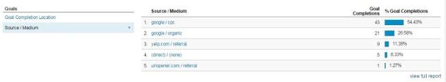
Head to the Conversions report, click on Goals, and select Overview. This will show you a list of the Goals set for this view. The trick here is to customize the view by selecting Source/Medium from the Goals list below the graph.
2) Segment and Conquer
By default, the overview is set to show the Segment of All Sessions. However, this overview does not allow us to make informed decisions about the precise details of the website’s traffic. So what I always do is segment each report to find out how one of my segments, for example Organic traffic, is doing versus the other, for example, Paid.
So I get to see all of my reports showing me a constant comparison of all of my traffic sources.

3) Add Another Layer to the Cake: Secondary Dimensions
You can easily review performance by traffic if you go to Acquisition and then Select Source/Medium, to get an overview per Traffic source. But if you are like me and you run more than one campaign per Channel at the same time, you might want to get more specific information.

From a regular Source/Medium Report select the Secondary Dimension that might give you the insights to analyze performance in detail. In this case I am using Campaigns.

4) Sort your Columns by Custom Metrics
Every time that I want to go over all of the terms used to find our website organically I get a list of terms that generate the highest amount of impressions. The same thing happens with other tables where the most important column is sessions and you are presented with the data sorted by it.
To fix this, simply select any other option in the columns such as my favorite, goal conversion rate.

5) Compare Date Ranges
A very simple way to analyze results is to compare all of the metrics to another time frame during the year and compare the same date ranges of two different years.
To set a date select it from the top right corner dropdown option, also on the bottom of this option you will find the compare checkbox and the option to customize it.

In this example, I am comparing the month of October with its previous period, September.

6) Metrics Hourly, Daily, Weekly or Monthly
Visualize and analyze your data in a different way just by selecting a different view of the charts, tables, and graphs in Google Analytics.
Set hourly when it is available in the report that you are viewing and display 24 data points, one for each hour of the day. Daily is the default view and shows daily values for the date range. For weekly views remember that they start on a Sunday and end on a Saturday.
Each data point includes the sum for the week. Partial weeks are not highlighted on the graph. Set monthly views where a month is an actual calendar month, where the number of days can vary from 28 to 31, depending on the particular month.

7) Plot Rows: How Much a Row Contributes to the Whole
With Plot Rows, you can graph any two rows alongside the overview. You can then easily determine how much a row contributes to the whole. Or you can compare two lines against each other to look for comparison trends.
This option will save you a lot of time and will answer the questions of how much of the entire graph data is made up of the metric we are interested in.
To use Plot Rows, just pick any one or two check boxes next to the rows you want to plot, then at the bottom of the table, hits the Plot Rows button.

8) Change the Primary Dimension or add the Secondary Dimension
Every report in Google Analytics is made up of dimensions and metrics. Dimensions describe the characteristics of your users, their sessions, and their actions. The dimension Source/Medium describes a characteristic of sessions and indicates the source/medium, for example, “Google/CPC” or “Bing/CPC”, from which each session originated.
The tables in most Google Analytics reports organizing dimension values into rows, and metrics into columns. In most Analytics reports, you can change the dimension and/or add a secondary dimension. For example, adding Campaigns as a secondary dimension to our table would result in the following:

For every Google Analytics report, you are able to select your own Primary dimension. The ability to change this option gives you the liberty of setting the data tables in a way that best fits your needs and that will give you a better perspective of the information to analyze.
To do this, find the list of primary dimensions above the data table and click the primary dimension you want to apply to the table.
9) Pivot Tables
Rearrange the information in the table using the Pivot Table option. This will work on certain reports by pivoting your data on a second dimension. From the top right of the table, select the Pivot button, it is normally the last one. Three drop-down menus appear above the table, Pivot by, Pivot Metrics and Select.

10) The Dashboard
There are some reports that cannot be added to the shortcut menus, including Dashboards. However, this feature itself surely is number one when it comes to personalized reports. You can select any amount of data from the report and present it as a graph, table, maps, lists.
Simply go to Dashboards report and customize your private dashboard or import one from the Gallery.

Start Saving Your Shortcuts
The Flow Visualization reports, Dashboards, Intelligence reports, Funnel Visualization report and the Multi-channel Funnel reports cannot be added to the Shortcuts section. You can access your saved Shortcuts by going to the Shortcuts section in the left pane.
These shortcuts are only viewable by you unless you share them and you can edit or delete them anytime. So start saving your shortcuts and ensure a more in-depth analysis and informed decisions.


