


[display-name-category]
[post_author]
The mobile apocalypse (aka Mobilegeddon) is one of the most significant events in the entire SEO industry. April 21st was the day when Google started rolling out a ranking algorithm that would give a boost to mobile-friendly pages in Google’s mobile search results.
Google officially reported that mobile searches are outdoing the desktop ones in the United States, Japan, and other countries around the globe, Mobilegeddon was a must.
After the algorithm had rolled out, non-mobile-friendly websites started to lose rankings, and mobile-friendly sites received the opposite effect.
All of these series of events created the need for marketing consultants, SEOs, and small business owners to have an effective mobile strategy in place ASAP and in this post, I’ll show you how.

So, How Do I Set a Mobile SEO Strategy in Place
Make Sure Your Mobile-Friendly Website Checklist is Done
To build an SEO strategy for mobile, a mobile website is in the need. But there are a few things you need to check to make sure your site will pass the test.
Use the Google mobile-friendly test tool: This is the very first thing you need to pass, the results are simple. Your site either is or is not mobile-friendly. A simple yes/no result.
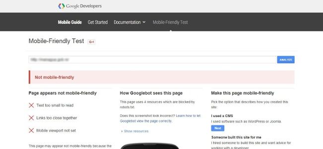
While the tool will list the most significant errors your site has, it’s nothing if in the real world your users are not getting the best mobile experience when browsing your site, so make sure your site nails it.
Google can tell if your site is mobile-friendly, but only when you give them the resources it needs to decide so. Allow search engines to understand the structure of your website by letting them crawl your JavaScript and CSS files.
The Web Needs to Know Where You Are (or Where you Operate)
In real life, if your customers don’t know where your business is, they won’t know about you. The same thing happens online, if the web doesn’t know your location, search engines won’t know you even exist.
Searches with a commercial intent made from a mobile device show results based on location. Just think about how many times you have searched for “pizza” (yeah, I know you do that. We all do). Several businesses show up in the results page way before an informative article comes up.
The closer your storefront is to the searcher, the bigger the chance for that customer to stop by your place. If you are a service area business and your customer is in that area you serve, there’s a high chance for them to see your result and give you a call.
Get in the Map
- Use geotags in your metadata and site content (when appropriate).
- Your business name, address, and phone number have to be consistent across the web, say social media, local listings, websites, etc.
- Add your address and the areas you serve to Google My Business.
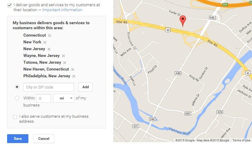
Most people oversee this last feature. While this won’t guarantee a boost in rankings in your service area, it will tell your potential customers where you actually operate and consider you for business in the future.
Mobile-Friendly Website, Check. What About my Content?
Searching on a mobile device is not the same as doing it on a desktop. Usually, mobile users perform a search to complete an action rather than exploring and navigating through different options.
Think about this when placing content elements. Your users need to know what you want them to do once they land on your site.
Highlight your call-to-actions
If you want your users to reserve one of your taxi cabs, place a button at the top of your landing page to “Make A Reservation” or “Reserve a Cab Today”. While mobile users tend to scroll more, that doesn’t mean that the most important elements of your mobile page will be seen if below the fold.
Create copy that is action-focused
Users searching from a mobile device are more willing to complete an action than the ones that are on desktop. Your copywriting has to encourage users to make business with you.
It’s not the same feel to read the phrase:
“If you have any questions, send us a message. Our team can help you”
than:
“Send us a message with your questions, our team of experts will help you.”
Make your phone numbers clickable
Unless you don’t want to be contacted via phone (and I can’t really think of a good reason for why you wouldn’t want that), every single mention of your phone number has to be a click-to-call link. Why? It’s simple. Every tap on a clickable phone number opens an application to call that number making it easy for users to contact you.
Make Sure your Website Still Nails It
With the addition of new content, website maintenance, and updates, some flaws will appear from time to time.
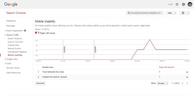
Locate and fix new mobile usability issues with Google Search Console. It will tell you if that new page has the appropriate font size or if the style of those new buttons are thumb-friendly, and more.
Have a few friends or family members search for your business from their phone and see how they do it. Note the terms they use for and how they browse the site. You might be impressed with how much insight this will give you when performing edits or moving things around.
Go Above and Beyond
Remember, having a mobile-friendly tag on Google search results is not exactly enough. Mobile-friendliness is not only about the site look but also about the user experience when on a mobile device. Work on making it easy for your customers to reach out to you from your website, get the web to know where your business is located and the area it serves.
If you have any other ideas about how to rock at mobile-friendly strategies, share them with us.


